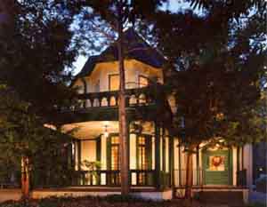
I loved my old home page and I was sorry to have to give it up a few years ago for something spare and linky/listy. I concede that the sparer style works better but I miss the narrative clutter, a non-design enthralled by hyperlinking right there in the flow of words. That little "latest news" link in the top left
blinked for about a year when that was the newest thing. Fortunately I knew that blinking links were bad news pretty quickly and reverted to plain old plain old as soon as the excitement faded. The old page dates back to 1994 and it looked more or less as you see above from 1994 until 2007 or '08! I maintain a
link to it and I imagine that most of the links still work. Prior to the site on top of which this old page sat

I had a wonderful gopher. This was of course before the graphical browser (Mosaic was the first, I think--before Netscape) and it was stiff and hierarchical but effective in conveying information and giving users a tour, in effect, of the material you wanted to present. I loved the chaos of hyperlinking once it was possible through this thing called "the world wide web" and, let me repeat, I felt that the hyperlinky text was the way to go. Eventually another kind of design became the standard. Now--what with drupal and blogs and blog-style user-enabled sites--we're back to a more cluttered surface, but still nothing like this single-look languagy flat surface.
 I loved my old home page and I was sorry to have to give it up a few years ago for something spare and linky/listy. I concede that the sparer style works better but I miss the narrative clutter, a non-design enthralled by hyperlinking right there in the flow of words. That little "latest news" link in the top left blinked for about a year when that was the newest thing. Fortunately I knew that blinking links were bad news pretty quickly and reverted to plain old plain old as soon as the excitement faded. The old page dates back to 1994 and it looked more or less as you see above from 1994 until 2007 or '08! I maintain a link to it and I imagine that most of the links still work. Prior to the site on top of which this old page sat
  I had a wonderful gopher. This was of course before the graphical browser (Mosaic was the first, I think--before Netscape) and it was stiff and hierarchical but effective in conveying information and giving users a tour, in effect, of the material you wanted to present. I loved the chaos of hyperlinking once it was possible through this thing called "the world wide web" and, let me repeat, I felt that the hyperlinky text was the way to go. Eventually another kind of design became the standard. Now--what with drupal and blogs and blog-style user-enabled sites--we're back to a more cluttered surface, but still nothing like this single-look languagy flat surface.


 "I teach horizontally, meaning that while I might begin with a fixed idea of what I'm going to teach that day, I let it drift rhizomatically way off topic, often pulling it back when it gets too far. I rely on non-fixed materials to teach this way; the whole world is at my fingertips. Should I go off on a tangent about John and Rauschenberg and their love relationship as expressed in Rauschenberg's bed, an image of that bed is always a click away. From there, we can head anywhere into the non-fixed universe, be it film, text or sound. And of course, that always takes us elsewhere. As Cage says, 'We are getting nowhere fast.'"

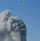 that anyone has yet got the imaginative measure of that terrifying day six years ago. Certainly our Tolstoy has not crawled out of the rubble. The closest we have, Don DeLillo, succeeded as an essayist-journalist ("In the Ruins of the Future: Reflections on Terror and Loss in the Shadow of September,” Harper’s, December 2001) but, to my mind, failed as a novelist ("Falling Man"). One reason, perhaps, is that the remembered emotion was instantly buried under a pile of cultural junk.' - Tod Gitlin in his review of Susan Faludi's The Terror Dream (written for